Project
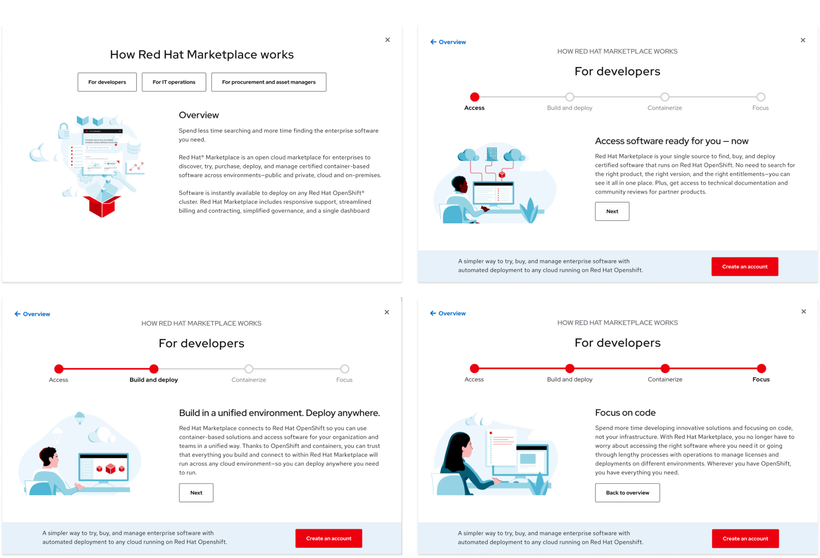
Red Hat's internal marketing team requested our help update and componentize and pre-existing informational modal used on marketing pages across the Red Hat website. Our task was to design and develop this modal component for Red Hat's internal component design system for a future update. The modal's content needed to provide a general topic overview and options for different user audiences to dive deeper.
Role
UX Designer / Digital Strategist
Team
- Craig Walker / Creative Director
- Kurt Edwards / Designer
- Ben Quirk / Senior Developer
Created at Centerline Digital for Red Hat MarketPlace (2021)
Research
The effort up front involved becoming familiar with the client's design guidelines for alignment on brand standards. The design system was in its infancy, so we had some flexibility around some navigation flows and the ability to push the current guidelines if needed.


Synthesis
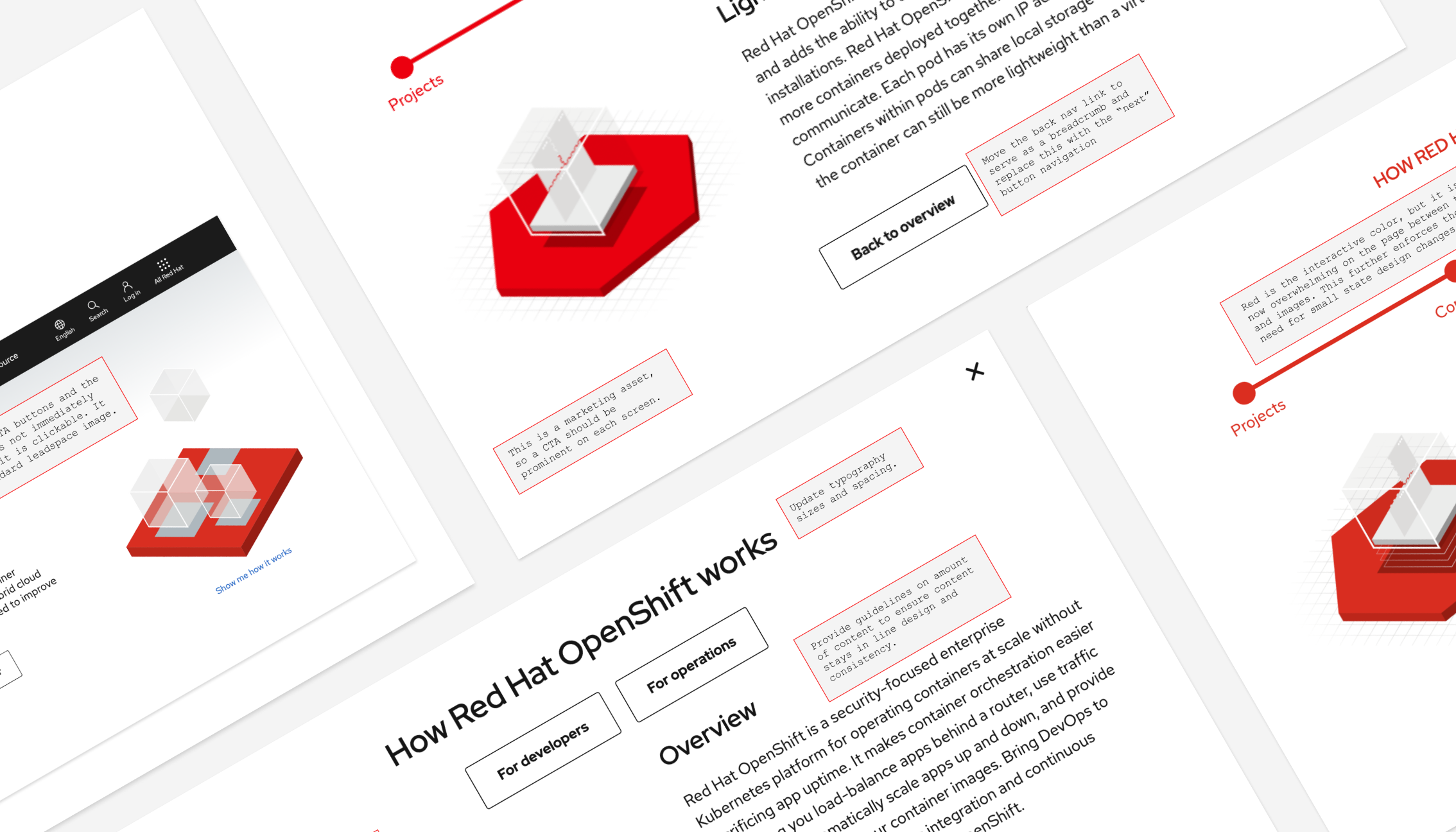
A general audit of the experience involving the user journey and interaction points produced a list of items that would benefit from a UX overhaul. In support of the audit findings, visual assets and recommendations were created to help communicate the idea.

Interaction
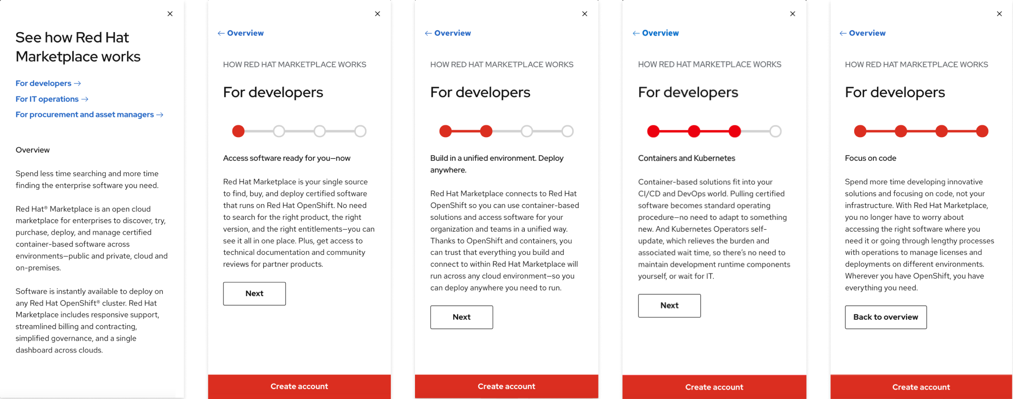
The main goal for the wireframe phase was to implement the audit findings and present those changes to the stakeholder and web dev team for transparency and approval to move forward.

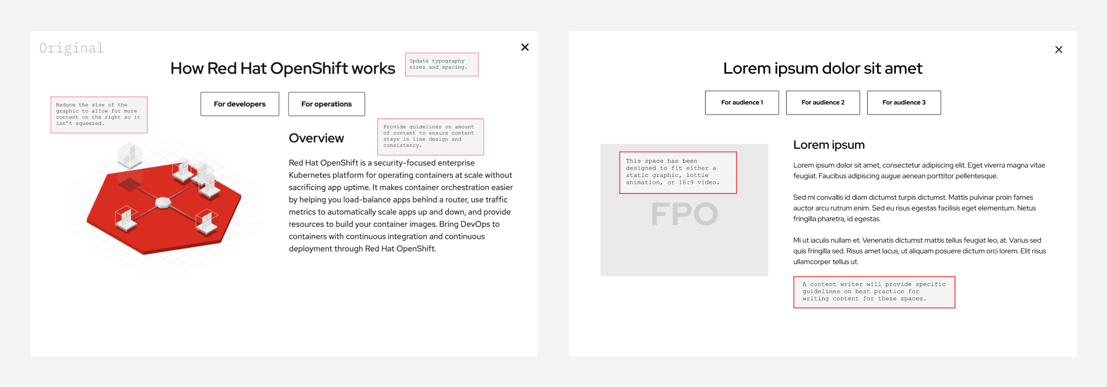
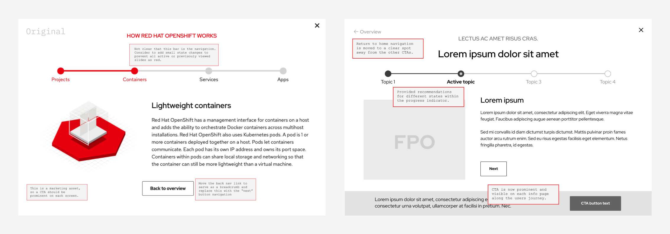
Following a progressive disclosure model approach, the original modal did not work well on mobile. The flow from slide to slide was housed in an accordion and required the user to do a lot of scrolling to see content within the modal.

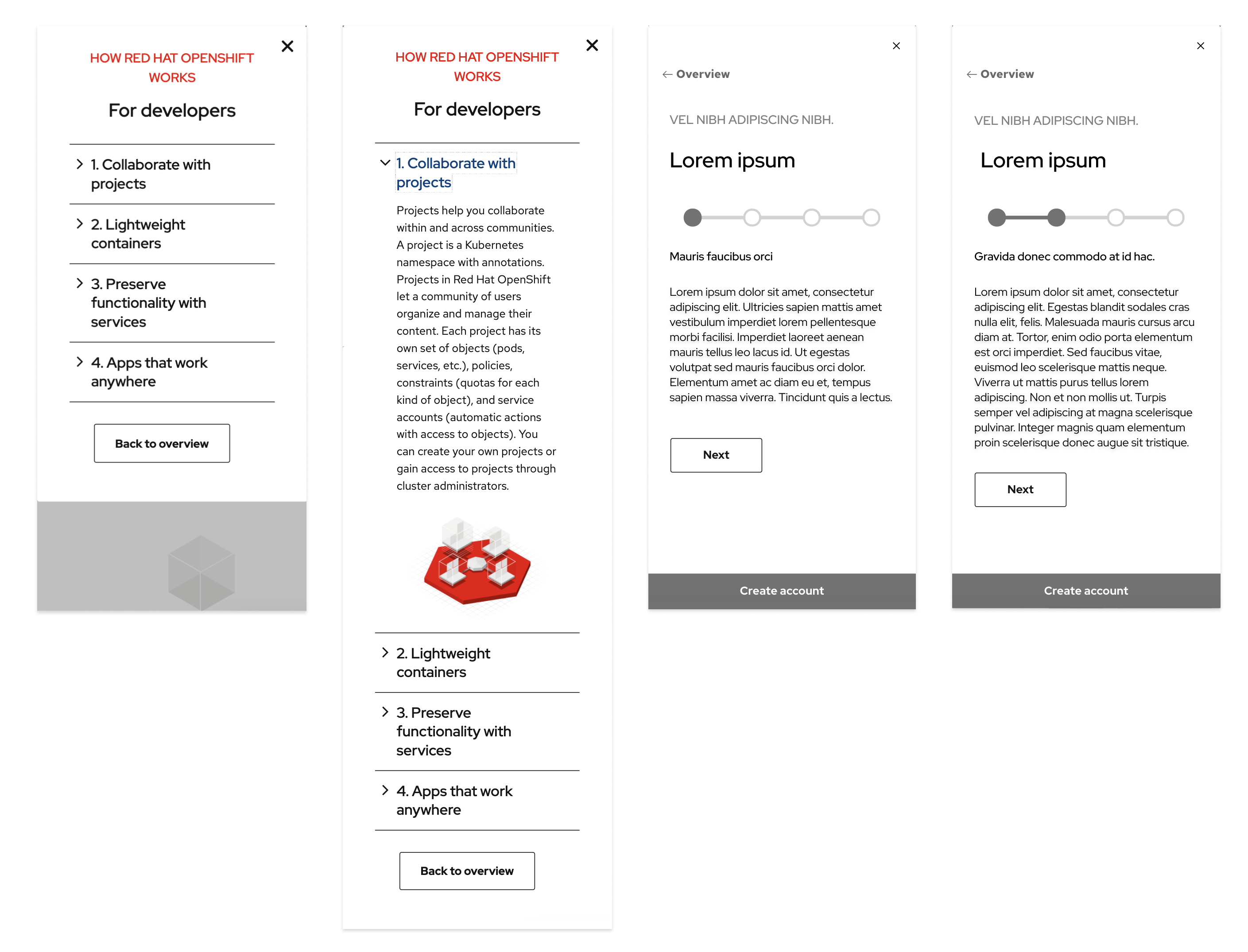
To ensure that all of the updates applied to the modal would be seen by users, we also needed to make sure we provided a better experience opening the modal from a page.

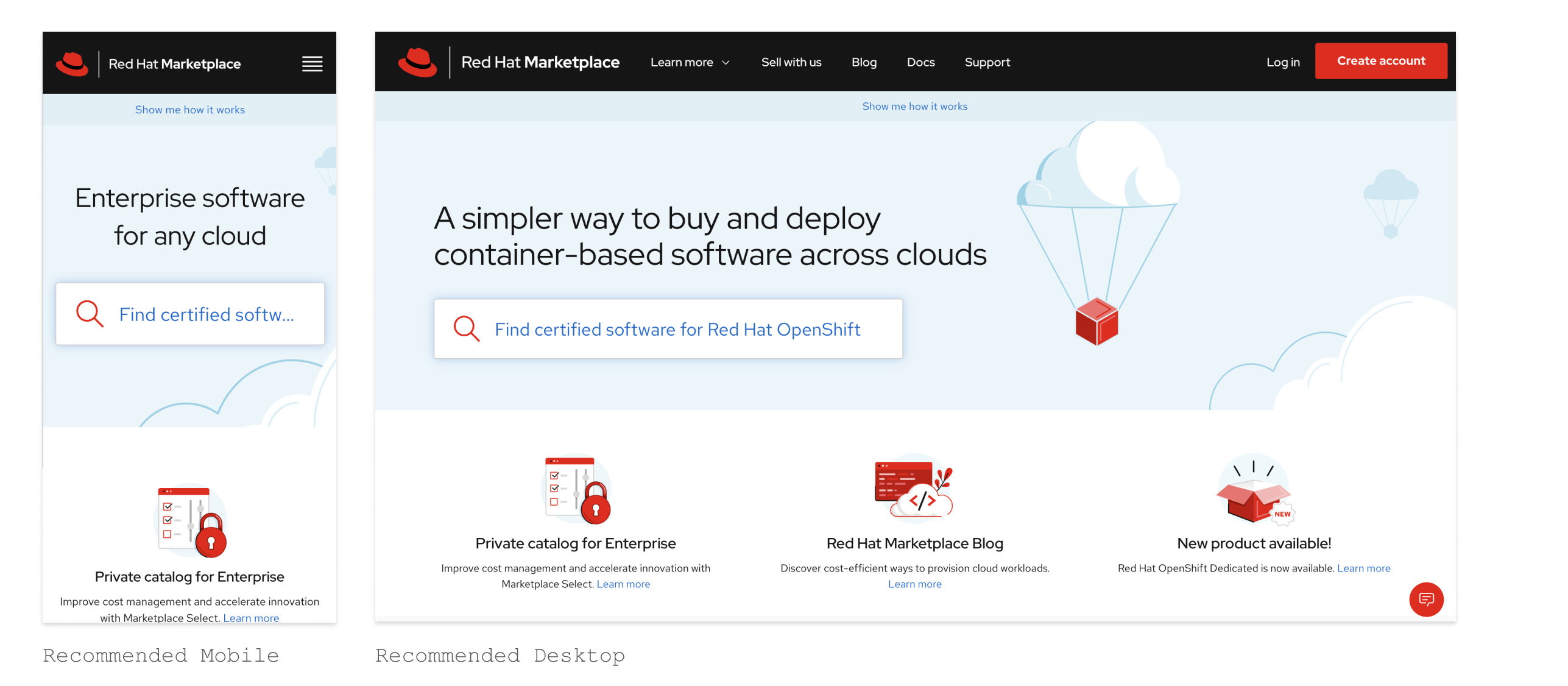
We needed an easy way to include the open modal element on any page. Buttons or images would not be easy to implement on pages without creating layout issues. That led me to focus on notification banners and alerts used across the web for several reasons, such as displaying a sale on an e-commerce page.

UI Design
Once wireframes were approved, I worked with the designer on implementing the brand design system and graphic assets.


Check out the live project on Red Hat Marketplace!