Project
PayPal wanted to upgrade their overall developer experience and wanted to start with their developer documentation website to make it easier to integrate products. Our goal was to provide PayPal's stakeholders with a recommended approach to provide a better structure and flow for developers navigating and using the site. We needed to advance the general developer experience discussion and understanding of the technical audience involved. Research findings and competitive analysis were used to create a strategic springboard for the internal marketing team to take over.
Role
UX Designer / Digital Strategist / Technical Lead
Team
- Greg Harbinson / Group Strategy Director
- Brooke Belk / Strategy Director
Created at Centerline Digital for PayPal (2020)
Research
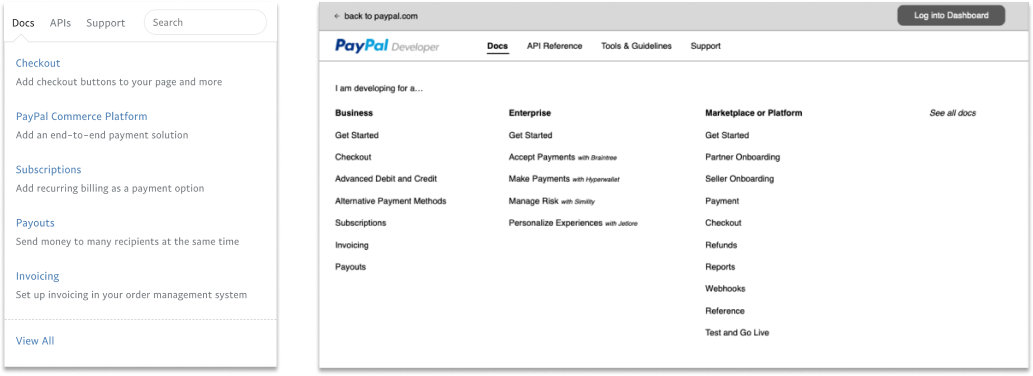
Unification, simplification, and navigation were the keys to helping our recommendations align with PayPal's CS strategy. In addition, we wanted to make sure that the developer's experience match's the overall PayPal experience and not be frustrated with the documentation.
The majority of research came by doing competitor audits and analyzing those findings to see where PayPal was doing well and where they could find improvements based on patterns found.
Key findings from developer audience interviews
- “I cannot easily find relevent content on pages”
- “What do I need to do first? How can I get started quickly?” (for new users)
- “I'm not exactly sure how it works... how do I use it?
- “Where are the step-by-step instructions“
- “Do I have to figure this out myself?“
Synthesis
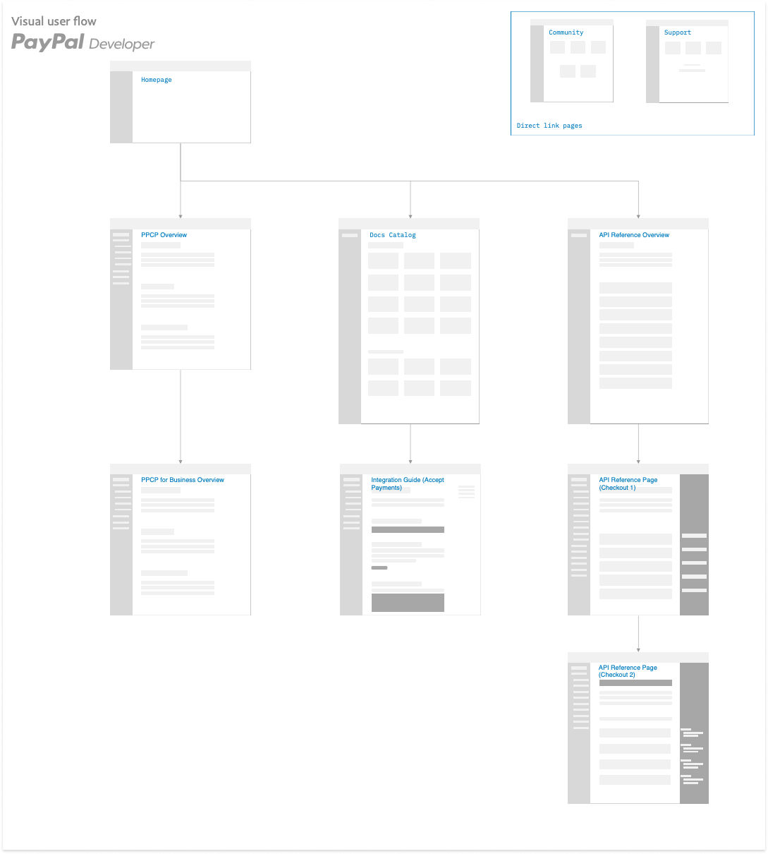
There were a few key factors that we needed to take a look at first. We needed to figure out the new navigation layout and the user journey through the documentation pages. Our approach was to provide the best possible recommendations to serve as guidelines for PayPal's internal strategic team when taking over ownership.
We needed to keep in mind that current developers using the documentation might get a shock and allow for frustration with the site. Therefore, one of the project's main goals was to make the experience easy and friendly.


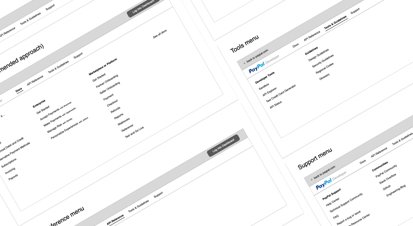
We worked through a few navigation recommendations to account for any pertinent information about the site's audience that we had not yet learned. We also wanted to provide plenty of suggestions to show that there are multiple opportunities to improve navigation.

The example shown below shows user flow interactions to help ensure that users were no more than three (3) clicks away from a solution or answer. Previously, users occasionally had to click 8-9 times to attempt to find a solution, and this was in alignment with simplifying the experience and navigation.

Interaction design
Based on the research finding, there were many great elements and components that could be integrated into the new site. These interactions went back to the priorities set earlier to ease navigation, provide more steps or details about the code, and giving related links or resources to find help.
These elements working together will help upgrade the entire developer site to a standardized and consistent page layout.

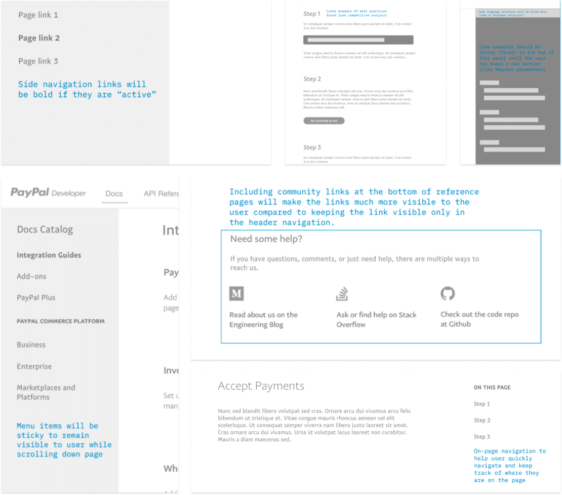
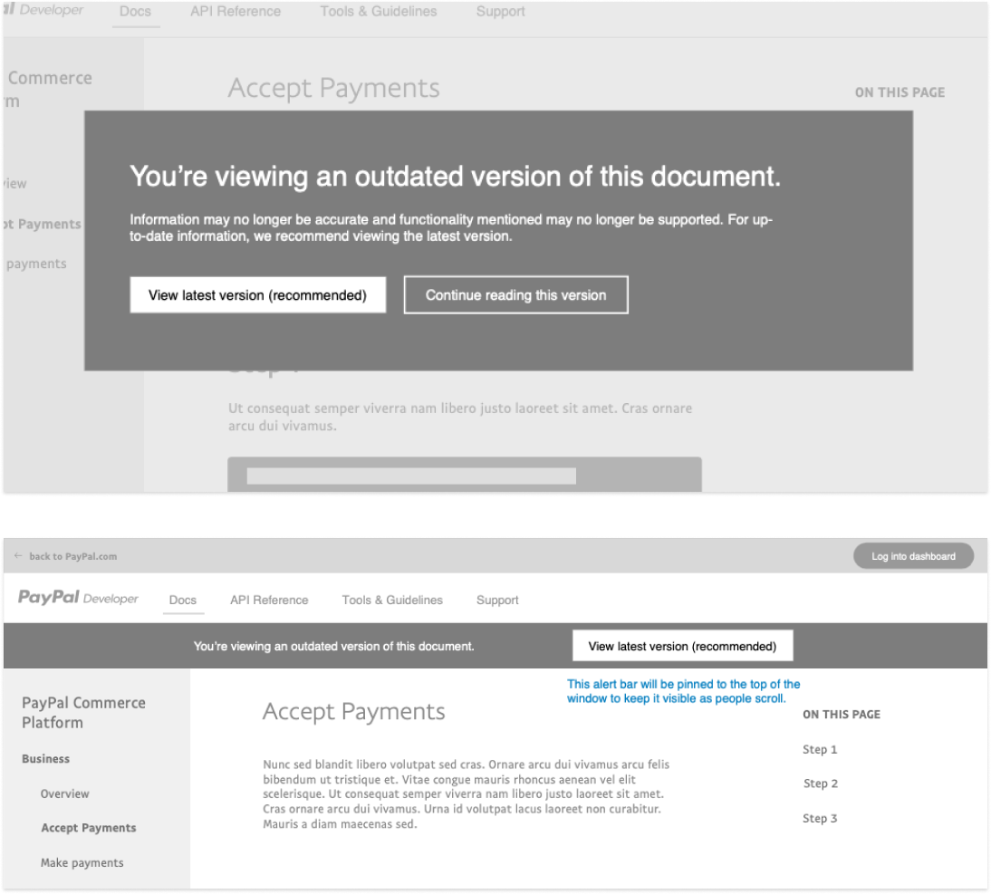
A key element I realized that was missing was documentation versioning. If a developer has the wrong documentation version, it will most likely lead to frustration and not wanting to use the product. We proposed the idea of alerting the user if they are on old documentation. If they are on current docs, a notification is not displayed.

Want to see what happened after we presented our recommendations? See the current and on-going progress on the PayPal Developer portal!